IDÉE / javascript / view-transition-api
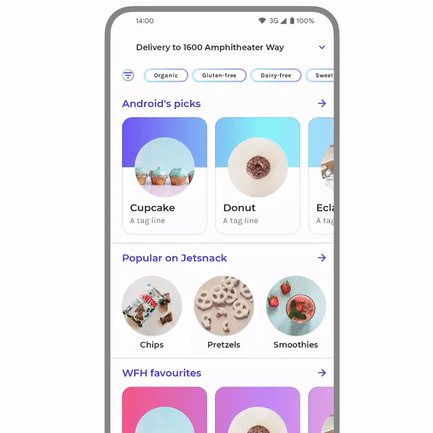
In native apps, we can see some animations that look very smooth as like the one shown below. These animations often begin and end using the same UI elements as transitions. This allows us to clearly see the elements changing shape, size, or position, rather than simply hiding one element and showing another. In Android development, this type of animation is called a shared element transition.
Now, on the web, we can also use this technique. It's called the View Transition API.
View Transition API
View Transitions are typically used for page navigation. For this demonstration, I'm using a modal to simulate a page change. While the View Transitions API provides the page-switching transition capability, the actual animation implementation is still achieved using the `animate()` method.
Doraemon: Nobita's Three Visionary Swordsmen

Doraemon: Nobita's Great Battle of the Mermaid King

Stand by Me Doraemon

Doraemon: Nobita's Earth Symphony

Stand by Me Doraemon 2
In conventional page navigation, View Transitions captures snapshots before and after the animation — ::view-transition-old and ::view-transition-new — and then performs the transition animation. In this demonstration, however, we’re primarily leveraging the transition capability itself. Instead of implementing a full page-level animation, we are targeting a specific element for the animation effects.
function ViewTransitionDemo() {const onTransition = (params: TransitionParams) => {const { element, nextElement, opacity, callback } = params;const rect = element.getBoundingClientRect();const node = element.cloneNode() as HTMLElement;node.className = "rounded-base";document.body.appendChild(node);const next = nextElement.getBoundingClientRect();const transition = document.startViewTransition(() => {node.style.cssText = `position: absolute; left: ${next.left}px; top: ${next.top}px; width: ${next.width}px; height: ${next.height}px; z-index: 999`;});transition.ready.then(() => {opacity("dialog", 1);node.animate([{transform: `translate(${rect.left - next.left}px, ${rect.top - next.top}px)`,width: `${rect.width}px`,height: `${rect.height}px`,},{ transform: "translate(0px, 0px)" },],{ duration: 450 },);});transition.finished.then(() => {opacity("image", 1);delay(100).then(() => document.body.removeChild(node));if (callback) callback();});};useEffect(() => {document.body.classList.add("view-transition-api");return () => document.body.classList.remove("view-transition-api");}, []);return <Template onTransition={onTransition} />;}
Implemented using JavaScript and CSS
As mentioned earlier, View Transitions are designed for page-level navigation. But can we achieve similar effects within a single page? I've explored implementing this using a combination of JavaScript and CSS.
Doraemon: Nobita's Three Visionary Swordsmen
Doraemon: Nobita's Great Battle of the Mermaid King
Stand by Me Doraemon
Doraemon: Nobita's Earth Symphony
Stand by Me Doraemon 2
This implementation primarily utilizes CSS transitions. JavaScript modifies animatable element properties (like width/height), allowing the browser to handle the actual animation rendering.
const onTransition = (params: TransitionParams) => {const { element, nextElement, opacity, callback } = params;const rect = element.getBoundingClientRect();const node = element.cloneNode() as HTMLElement;node.className = "rounded-base transition-all duration-350 ease-linear";node.style.cssText = `position: absolute; left: ${rect.left}px; top: ${rect.top}px; width: ${rect.width}px; height: ${rect.height}px; z-index: 999`;document.body.appendChild(node);requestAnimationFrame(() => {const next = nextElement.getBoundingClientRect();node.style.left = `${next.left}px`;node.style.top = `${next.top}px`;node.style.width = `${next.width}px`;node.style.height = `${next.height}px`;opacity("dialog", 1);});delay(600).then(() => {opacity("image", 1);document.body.removeChild(node);if (callback) callback();});};
Implemented using JavaScript
Doraemon: Nobita's Three Visionary Swordsmen
Doraemon: Nobita's Great Battle of the Mermaid King
Stand by Me Doraemon
Doraemon: Nobita's Earth Symphony
Stand by Me Doraemon 2
Unlike the previous CSS transition approach, this implementation leverages the Web Animations JavaScript API.
const onTransition = (params: TransitionParams) => {const { element, nextElement, opacity, callback } = params;const rect = element.getBoundingClientRect();const node = element.cloneNode() as HTMLElement;node.className = "rounded-base";document.body.appendChild(node);const next = nextElement.getBoundingClientRect();node.style.cssText = `position: absolute; left: ${next.left}px; top: ${next.top}px; width: ${next.width}px; height: ${next.height}px; z-index: 999`;opacity("dialog", 1);const animate = node.animate([{transform: `translate(${rect.left - next.left}px, ${rect.top - next.top}px)`,width: `${rect.width}px`,height: `${rect.height}px`,},{ transform: "translate(0px, 0px)" },],{ duration: 450 },);animate.onfinish = () => {opacity("image", 1);delay(100).then(() => document.body.removeChild(node));if (callback) callback();};};